Master of the Camera
Karl Blossfeldt: Nature as Art
Graphic Design/ Editorial Design
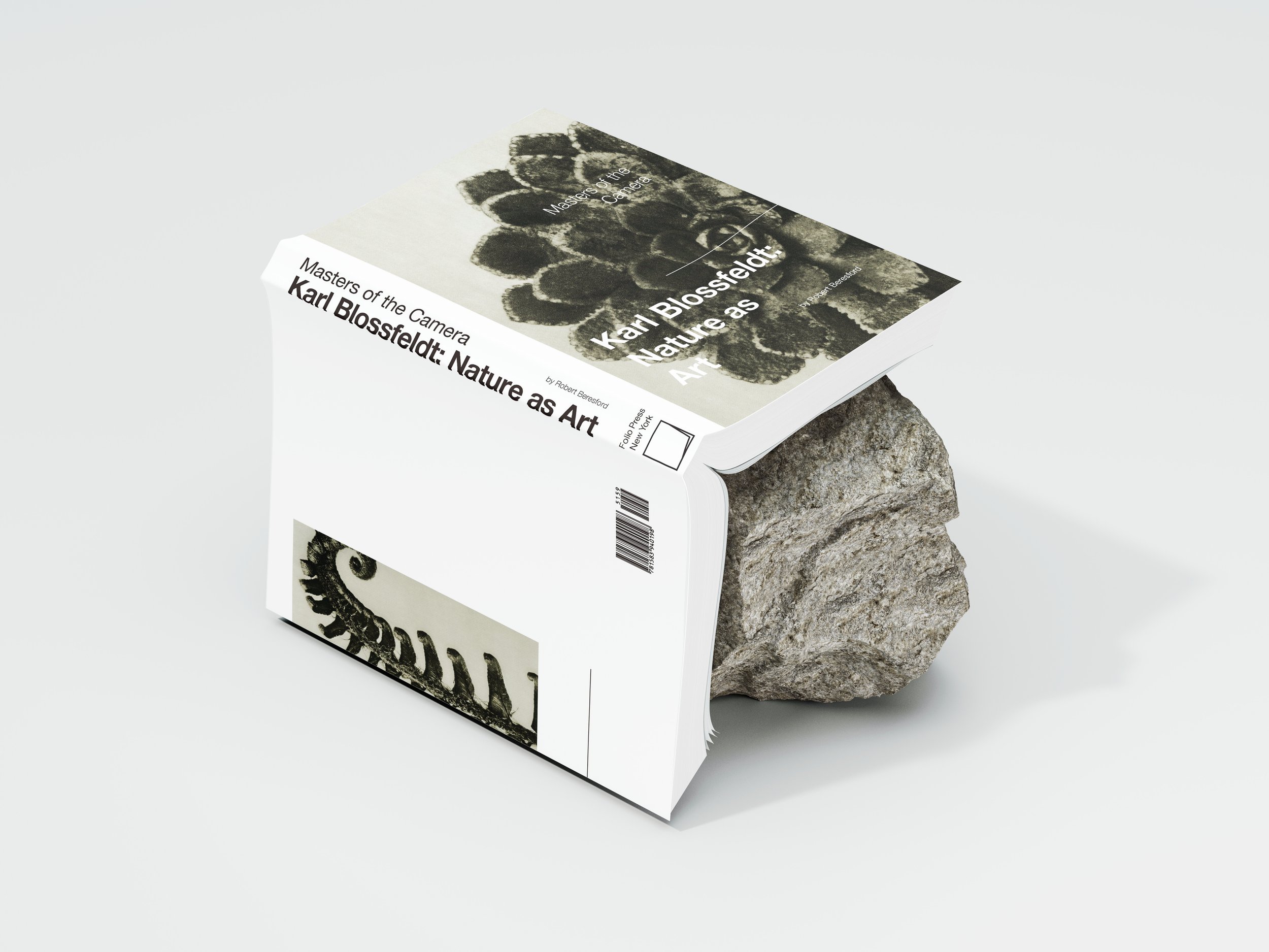
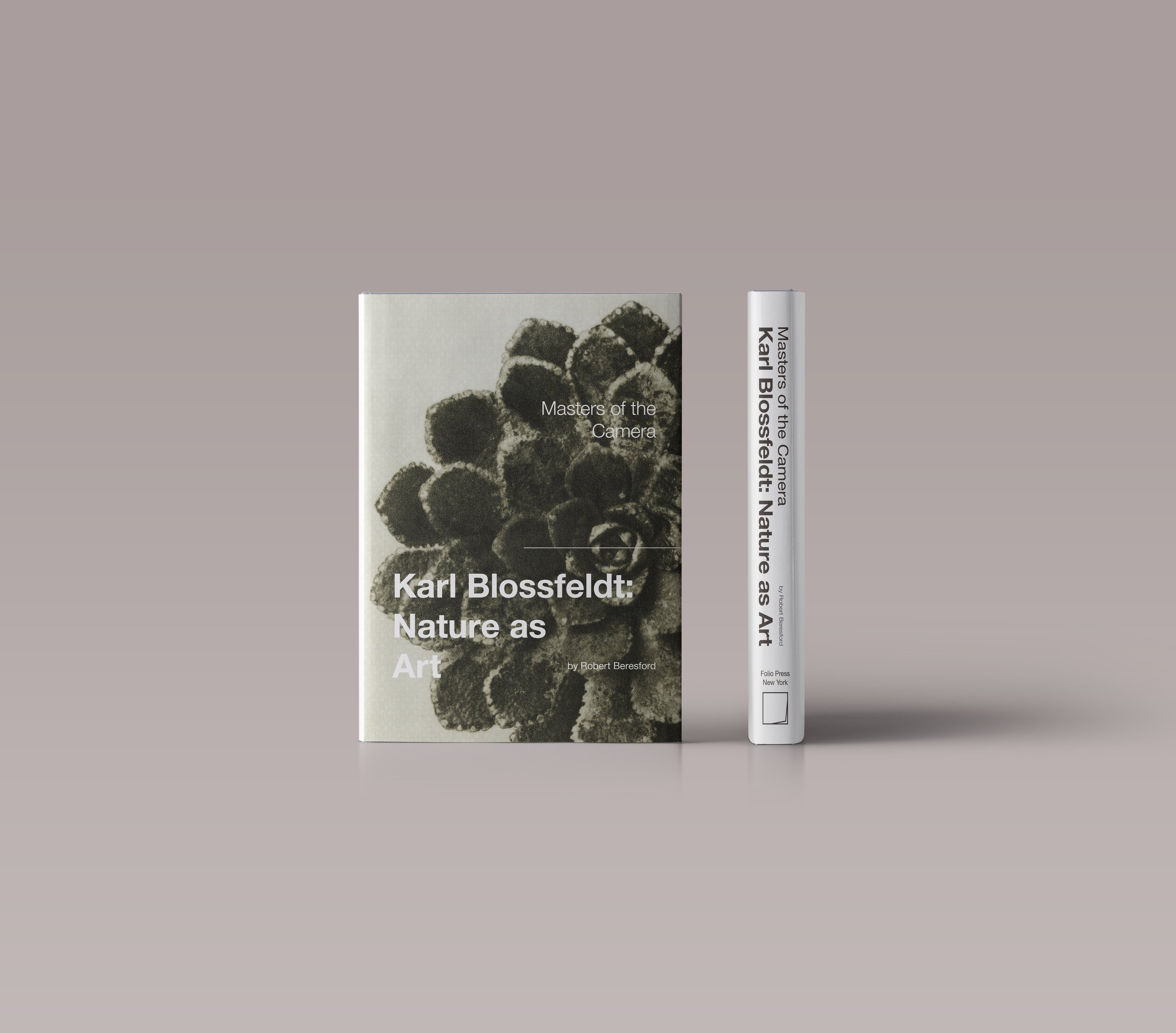
Based on the text content and related images in the book, I redesigned the cover, spine and detailed pages of the book. The layout of this project demonstrates my ability to design physical books. In terms of typefaces, I chose a sans serif typeface for titile text because I think sans serif typefaces are more eye-catching and have a more modern style. I chose a serif typeface for the body text. First of all, I wanted to increase the contrast with the titile text. In addition, I think serif typefaces are more readable when used as body text.